Saturday, March 19, 2016

Zoo Portraits Finally Completed

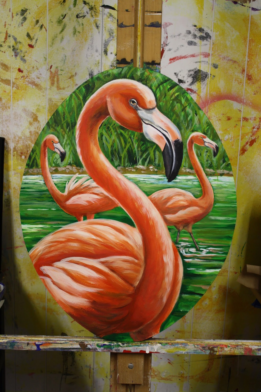
I have finally completed all 16 portraits for the Zoo's Carousel, which is up and running again after a gear box break-down. I will post these over a succession of days.
Yay.

Sunday, September 27, 2015

Direct from Paris

Here is a valet desk painted for a CBD hotel... the idea was to take the shell emblem from the column behind the desk and enlarge the design.  Personally, I think it's tres chic.... like it came straight from Paris, baby!  Oui, Oui, no?  Yet it is SOOO New Orleans- a little black, a little gold, a little like a feathered Mardi Gras mask AND a fleur de lis combined, not to mention that elegant decadence flair that "NO" is known for.


Monday, August 10, 2015

Check Out that Nutria!

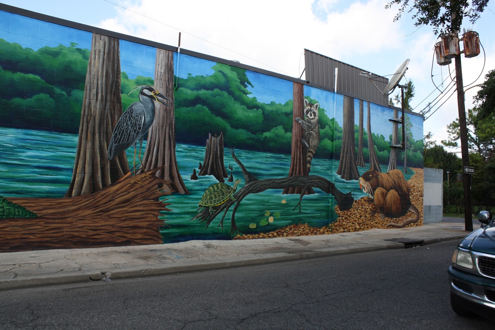
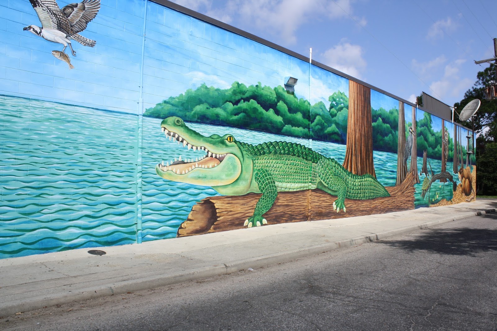
Most people love the nutria almost as much as they love the 45' long alligator!  Diana Shortez helped with the basics and the leaves around him, Andrea helped add some shading, and I put the finishing touches on his furry back.  Thanks also to Brandon Paillant, who did about 80-90% of the trees, Amy Reuben and Wendi Berman for all their help prepping, priming and basicking.  

And thanks to every neighbor and passerby for telling me how much the love it!  It is your mural as much as mine.  Muah!


Breaux Mart Mural: A Celebration of Audubon Zoo's Swamp Exhibit

Okay, so it only took me two weeks to finally post these!  That's because I STILL want to work on it, though I'm "sort of" letting it go!  This mural is 17' tall x 160' wide... and took me and some assistants 5 weeks to complete in the Louisiana summer heat!  


Tuesday, June 16, 2015

Gulf Coast Bank Logo Mural- 28' x 32'

I have been so busy, I have some catching up to do with my posts.  In April, my assistant, Pedro and I painted the Gulf Coast Bank logo on their wall with a "vintage look".  For this one, I felt that it shouldn't have any missing areas as you sometimes see in truly older, faded murals, so I simply played with the concept of how color fades with time to different hues.  I think it came out with more of the look of a Venetian scumble, which I think suits the modern approach of this bank.


Sunday, June 14, 2015

"The Old 77": Interior Sign Work

 My work with "The Old 77" started with the recreation of this old sign, which once graced the side of the building back in the late 1800's.  We agreed that I should paint it to look as if they had discovered it under the plaster wall they had just removed most of.  It's the favorite photo-op for nearly all the guests!
The image below is behind the bar of Nina Compton's restaurant at the hotel, "Compere Lapin".  I had to duck in close to avoid photographing the lights hanging over the bar.  I would have loved to "punch out" the bunny logo a bit more, but they preferred it more subtly stated.  It's definitely delightful in person, so make sure you go eat there sometime!

 The next two are part of a series of directional signs I'm doing through-out the first floor, some on drywall, some one brick as shown below.


Wednesday, June 10, 2015

"The Old 77" Blade Sign

The project manager of the "Old 77 Hotel" renovation asked me to age their brand new blade sign to make it look to be around 30 years old.  Most of my "faux" work was executed at A-1 Signs, Inc, the company that constructed and installed the sign.  I aged the white letter cans separately, then the white border and black background after all cans, and lighting were attached and wired.  The fellows in the shop shaking their heads in amazement, but the proof was the day they installed it.  Some passersby said, "Wow- where'd ya get that old sign?!"  Unfortunately, the camera didn't perfectly catch all the nuance, but if you zoom into the shop shots, you can see the rusty drizzle...